
By: Uchenna Mgbaja, Md Mahbub Mishu, Maryam Zamani, Sumithra Balamurugan, and Aya Heba; NorQuest College
As per the 2021 census, there were 5-million rental households in Canada, which means roughly one-third of Canadian households are renters. However, much of this rental activity occurs privately, leading to limited and inconsistent data. To bridge this knowledge gap, we acquired processed, analyzed, and visualized rental listings from the stakeholder – Community Data Program, for Ontario. This dataset offers new insights into spatial trends in metropolitan and small community housing markets, which surpasses other available sources in detail and granularity. Notably, cities like Toronto, Brampton, and Mississauga exhibit high rental prices per square foot, reflecting the region's economic dynamics. We also analyzed areas in Ontario where the population is less than 10,000.
This study aims to address three main objectives:
- interpret trends in datasets and their implications for the housing market,
- apply ML models to the datasets so that the model can forecast future trends, and
- deployment of the best model.
Methodology
We acquired a robust dataset from our client which comprised of 18 columns detailing the regions, bedrooms, addresses, and other pertinent information.
To extract valuable insights, we employed coding techniques and visual representations such as charts and graphs. This helps us to successfully unearth key patterns in housing dynamics, particularly identifying regions with noteworthy differences in housing expenses and density of listings.
Exploratory data analysis
For the exploratory data analysis (EDA), we selected small communities based on their population count. This approach helped us narrow our focus and gain a better understanding of the housing dynamics in these specific regions. However, the "Price" column of our dataset contained inconsistencies such as dollar signs and commas, making it difficult to analyze. To clean this, we removed special characters and converted the column to a numerical format. This enabled us to perform numerical operations and visualize the data, effectively.
Next, we identified that some records in the "Bedrooms" and "Bathroom" columns contained complex entries like "2+ Den," where the regex function only captured the numbers, ignoring the additional "Den." This led to inaccuracies in the representation of bedroom and bathroom counts. To address this issue, we created a temporary column to identify "+ Den" entries, converted 'Bedrooms' and 'Bathrooms' to numeric values, and adjusted the counts to account for the "Den" part. Afterward, we dropped the temporary column, ensuring accurate bedroom counts for each property listing.
The "Size" column contained non-numeric values such as "Not Available" which caused errors when attempting to convert the column to a float data type. To address this issue, we replaced non-numeric values like "Not Available" with NaN (Not a Number) using pandas' replace() function.
Entries in the "Size" column that were below 200 or above 9000 square feet were considered outliers and did not make sense in the context of property sizes. These outliers could skew analysis and visualization results if not addressed appropriately.
Geographical map of rental listings in Ontario
In this section, we used Google's Looker Studio to generate graphs, charts, maps etc., as well as Plotly Express in Python for the visualizations of the dataset.
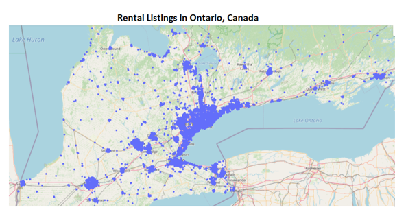
Description - Figure 1: Generating Geographical data Using Plotly.
This image displays a geographical map of Southern Ontario, highlighting the distribution of rental listings captured in the dataset. Each listing is a distinct point on the map.
We created a scatter map (shown in Figure 1 above) using Plotly Express. Each point on the map represents a property listing. We chose an open street map style for clarity and simplicity.
Histogram representing the distribution of rental prices
The histogram (shown in Figure 2) allows users to explore the distribution of rental prices. To ensure that the visualization is intuitive, we maintained clear labels for axes, title, and provide a concise explanation of what the histogram represents.
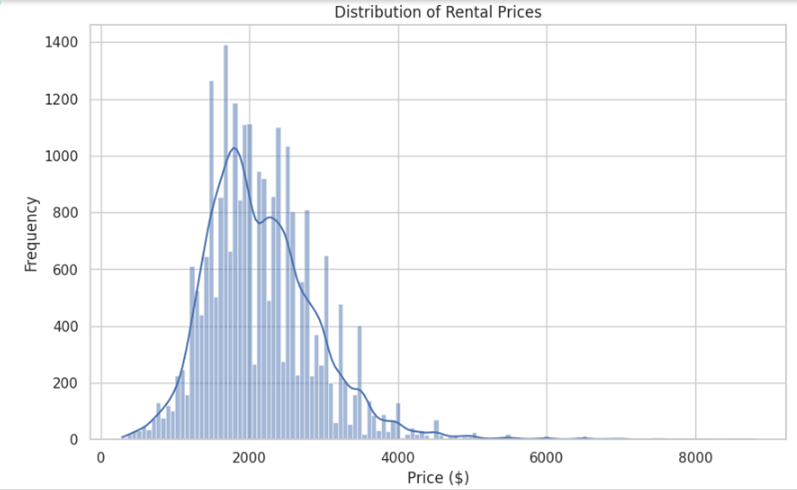
Description - Figure 2: A histogram depicting the distribution of rental prices from a dataset.
The x-axis represents the rental prices in dollars, ranging from 0 to $8000, while the y-axis shows the frequency of listings at various price points. The distribution appears right-skewed, indicating that most of the rental listings are concentrated in the lower price range, with fewer listings at higher prices.
Scatter plot representing the size and price with the number of bedrooms
The scatter plot (shown in Figure 3) allowed users to explore the relationship between size, price, and the number of bedrooms in a rental property. Users can identify trends, such as how prices vary with the size and numbers of bedrooms.
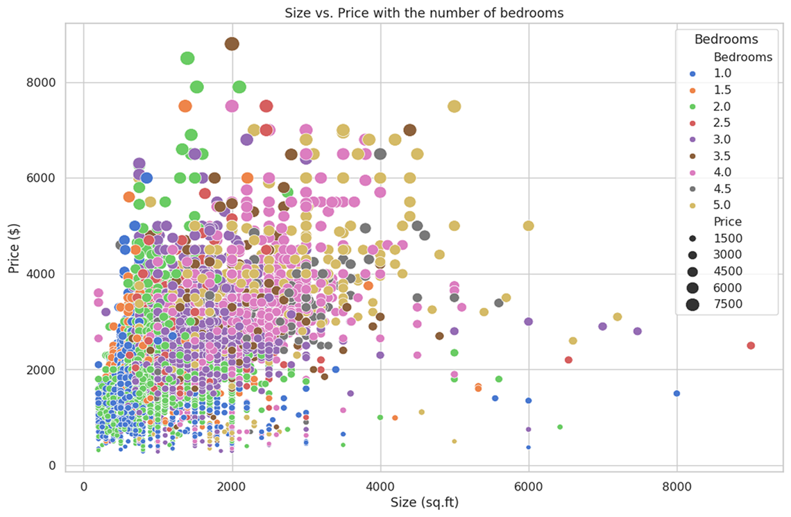
Description - Figure 3: scatter plot that illustrates the relationship between the size of a property and its rental price.
This image depicts a scatter plot that illustrates the relationship between the size of a property (in square feet) and its rental price (in dollars), with a further dimension showing the number of bedrooms. The x-axis represents the size of the property, ranging from 0 to 8000 square feet, and the y-axis represents the price, from $0 to over $8000.
Box plot representing price distribution based on number of bedrooms
The boxplot (shown in Figure 4) allows users to identify trends in price distribution based on the number of bedrooms. Analyzing outliers can provide insights into exceptional properties and market trends, helping users make informed decisions regarding rental or investment properties.
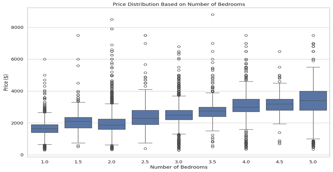
Description - Figure 4: Price distribution based on number of bedrooms.
This image shows the variation in rental prices across different bedroom configurations. Each box plot segment shows the median, quartiles, and outliers in rental prices, providing a visual summary of how bedroom count influences rental costs. Outliers are represented as individual points above and below the boxes, indicating variations from typical rental prices for each category.
Bar charts for the top ten most expensive and least expensive regions in Ontario
The bar charts (shown in Figures 5 and 6) provide insights into regional price distributions, highlighting the top ten most expensive and least expensive regions. Users can identify trends, such as regional disparities in rental prices, and make informed decisions by targeting regions with lower average prices for investment opportunities.
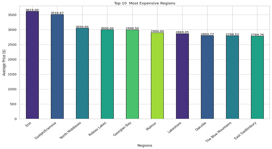
Description - Figure 5: Top ten most expensive regions
This image displays the average rental prices across various regions in Ontario. The y-axis measures the average price in dollars, showing values from $0 to $3,500+.
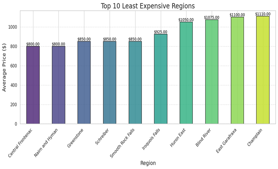
Description - Figure 6: Top ten least expensive regions
This image displays the average rental prices across various regions in Ontario. The y-axis measures the average price in dollars, showing values from $0 to $1000.
Pie chart provides insights into the distribution of property types
The pie chart (shown in Figure 7) provides insights into the distribution of property types in the rental market. Users can identify the most prevalent property type, such as apartments, which accounts for the largest percentage (37.6%). This information can help users make informed decisions, such as best property types for investment or rental opportunities.
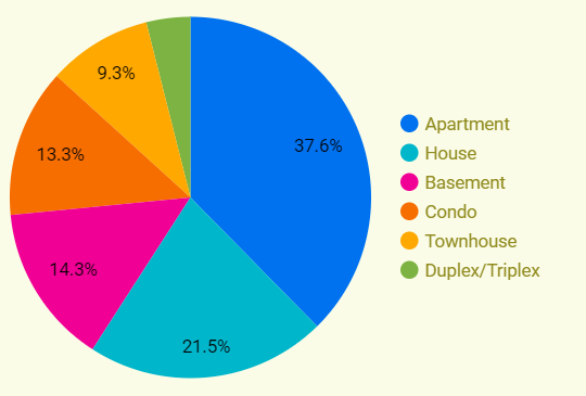
Description - Figure 7: Pie-chart for different types of properties in Ontario.
This image displays a pie chart illustrating the distribution of different types of rental properties available in a dataset. The chart segments are colour-coded and labeled with corresponding percentages to represent each property type's proportion within the total dataset.
Applying Machine Learning to cleaned data
To predict the rental prices, we applied machine learning (ML) models to our dataset. Our data is not time series, as the listings cover various dates without a consistent reference period. Instead, we focused on predictive regression models to predict rental prices which is our target variable. These models helped us analyze and predict price movements based on various features like location, property type, and amenities.
We trained various Machine Learning Models as shown below.
- Regression Models:
- First, we split the dataset into training and test sets. 80% for training and remining 20% for testing. This approach ensured that the model was trained on a substantial portion of the data while retaining a significant portion for testing.
- Next, we trained the model using Regressor models- Random Forest, Linear Regression & Gradient Boosting models to predict rental prices – which was our target variable/label.
- Our next step was to carry out cross-validation and for this we used k-fold cross validation technique to assess model performance and generalization.
- Finally, we evaluated the models based on the following performance metrics:
- Root Mean Squared Error (RMSE): This metric measures the average magnitude of the errors between the predicted values and the actual values. The lower the RMSE value, the better the model.
- R-squared (R2) Score: This metric indicates how well the regression model's predictions fit the actual data. The higher this value, the better the model's prediction.
- Classification Models
To enhance our analysis, we transformed the regression problem into a classification problem by setting price thresholds. Specifically, we categorized rental prices into three distinct groups: low, medium, and high. The thresholds were selected based on the distribution of prices in the dataset, with bins set at 0-1500, 1500-2500, and above 2500. This categorization allowed us to apply classification models, such as Random Forest (RF) and Decision Tree (DT), to predict the rental price categories. This approach is subject to the user's perspective of what is considered a high or low price.
We also developed classification models to predict the rental property type based on the given features. The goal was to recommend a suitable property type based on the user's specifications.
Results
Regression Models
After training and evaluating multiple ML models, it was determined that based on comparative evaluation, the linear regression exhibited superior performance compared to other regression models.
| Model name | RMSE | R2 |
|---|---|---|
| Random Forest Regressor | 483.05 | 0.6120 |
| Linear Regression | 467.54 | 0.6568 |
| Gradient Boosting | 488.56 | 0.6372 |
Description - Table 1: Performance from ML models.
This table compares the performance of three different ML models using two metrics: RMSE (root mean square error) and R^2 (coefficient of determination). The table lists the following models: Random Forest regressor, linear regression, and gradient boosting. The RMSE and R^2 values are provided for each model to evaluate their accuracy and predictive power, respectively. The linear regression model exhibits the lowest RMSE at 467.54 and the highest R^2 value at 0.6568, indicating it performs better compared to the others.
Classification Models
The table below provides a detailed comparison of three machine learning models—Logistic Regression, Decision Tree, and Random Forest—used to classify rental property prices into different categories based on their features. The metrics considered for comparison are the accuracy, precision, and recall scores achieved by each model. These metrics are crucial in evaluating the effectiveness and reliability of the models in predicting rental property prices.
| Model Name | Accuracy | Precision | Recall |
|---|---|---|---|
| Logistic Regression | 0.73 | 0.81 | 0.81 |
| Decision Tree | 0.73 | 0.77 | 0.80 |
| Random Forest | 0.74 | 0.79 | 0.80 |
Description - Table 2
This table highlights the performance of different machine learning models in classifying rental property prices. The random forest model outperformed the other models in terms of accuracy, achieving a score of 0.74. Both logistic regression and decision tree models achieved the same accuracy score of 0.73. In terms of precision and recall, the logistic regression model achieved the highest score of 0.81, making it slightly better in identifying true positive instances. This comparison provides valuable insights into the effectiveness of these models in predicting rental property prices and helps in selecting the most suitable model for this task.
Feature selection methods: P-values
The concept of p-values in statistical analysis is fundamental for determining the significance of observed results. In hypothesis testing, particularly in the context of feature selection for ML models, p-values help assess the strength of evidence against a null hypothesis. A low p-value typically indicates that the observed data is unlikely under the assumption that the null hypothesis is true, leading to the rejection of the null hypothesis in favour of an alternative hypothesis.
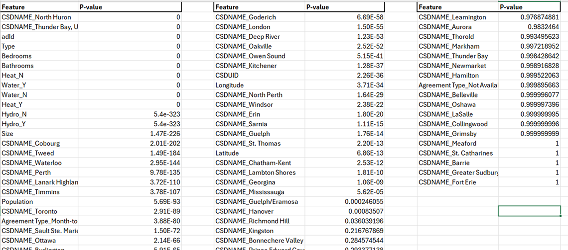
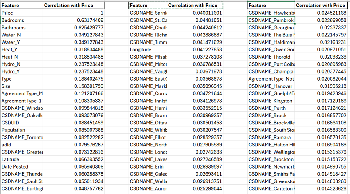
Description - Table 3: P-value results.
This table displays p-values associated with different features from a dataset, segmented into three separate columns for clarity. Each column lists features such as geographical names, property attributes and other factors. The corresponding p-values indicate the statistical significance of each feature in relation to the target variable, price. Features with p-values close to 0 suggest strong statistical significance, whereas values closer to 1 indicate weak significance. This format helps in identifying the most influential factors affecting rental prices.
In the above output, the data frame showcases feature names alongside their corresponding p-values derived from the ANOVA F-test. This statistical technique assesses the significance of individual features concerning the target variable "Price". A smaller p-value signifies a stronger association between the feature and the target variable, indicating a higher likelihood that the feature is relevant for predicting housing prices.
Notably, features such as "Hydro_N" "Hydro_Y" "Size" and various geographical indicators exhibit extremely low p-values, underlining their substantial impact on determining housing prices.
Correlation method
Correlation analysis is a statistical technique used to measure the strength and direction of the linear relationship between two variables. In the context of feature selection for ML, correlation analysis helps identify which features are highly correlated with the target variable and have a significant impact on predicting the target. A correlation coefficient ranges from -1 to 1, where:
- A correlation coefficient of 1 indicates a perfect positive linear relationship, meaning that as one variable increases, the other variable also increases proportionally.
- A correlation coefficient of -1 indicates a perfect negative linear relationship, meaning that as one variable increases, the other variable decreases proportionally.
- A correlation coefficient close to 0 suggests little to no linear relationship between the variables.
Description - Table 4: Price correlation.
This table presents the correlation coefficients between various features including geographical locations (CSDNAME), attributes of the properties and other relevant variables. The correlation values range from -1 to 1, where values close to 1 or -1 indicate a strong positive or negative correlation with rental prices, respectively, and values near 0 suggest a weak or no correlation. This type of analysis helps in understanding which factors are most strongly associated with changes in rental prices.
In above output, the correlation coefficients between the "Price" (target variable) and other features are listed. "Bedrooms" and "Bathrooms" have relatively high positive correlations with "Price" (0.63 and 0.63, respectively), indicating that as the number of bedrooms or bathrooms in a property increases, the price tends to increase as well.
"Water_N" and "Water_Y" have the same correlation coefficient of 0.35 with "Price" suggesting that the presence or absence of water access might influence property prices to some extent.
Features such as "CSDNAME_South Frontenac" "CSDNAME_Norwich" and "CSDNAME_Chatsworth" have very low positive correlations with "Price" (close to 0), indicating weak linear relationships between these geographic indicators and property prices. We made informed decisions to retain only the most relevant geographic features based on domain expertise. This meticulous feature selection process contributed to a more robust and effective machine-learning model for predicting property prices.
Creating a Rental Housing Insights Application
The creation of the Rental Housing Insights Application represents a comprehensive effort to leverage data science techniques in analysing rental housing data. This section outlines the development process, key features, and the potential impact of the application on stakeholders and the community.

Description - Figure 8: Community App.
Screenshot of the Community App interface. On the left side, a sidebar with the option to "Select a Page" with multiple options listed such as Dashboard, EDA, ML Modeling, ML Modeling (Type), Community Mapping, Small Community Mapping, and Google's Looker Studio.
Application Development
The application is developed using the Streamlit framework, using Python. The development process involves several key steps:
- Data preprocessing: Cleaning and formatting the rental housing dataset to ensure data quality and consistency.
- Feature engineering:Creating new features and transforming existing ones to enhance model performance and interpretability.
- ML modeling: Training and evaluating predictive models to forecast rental prices and property types.
- User Interface Design: Designing an intuitive and user-friendly interface for seamless navigation and interaction.
Features
The Rental Housing Insights Application offers the following key features:
- Dashboard: Provides an overview of the project objectives and key findings.
- Exploratory data analysis (EDA): Allows users to explore rental housing data through visualizations.
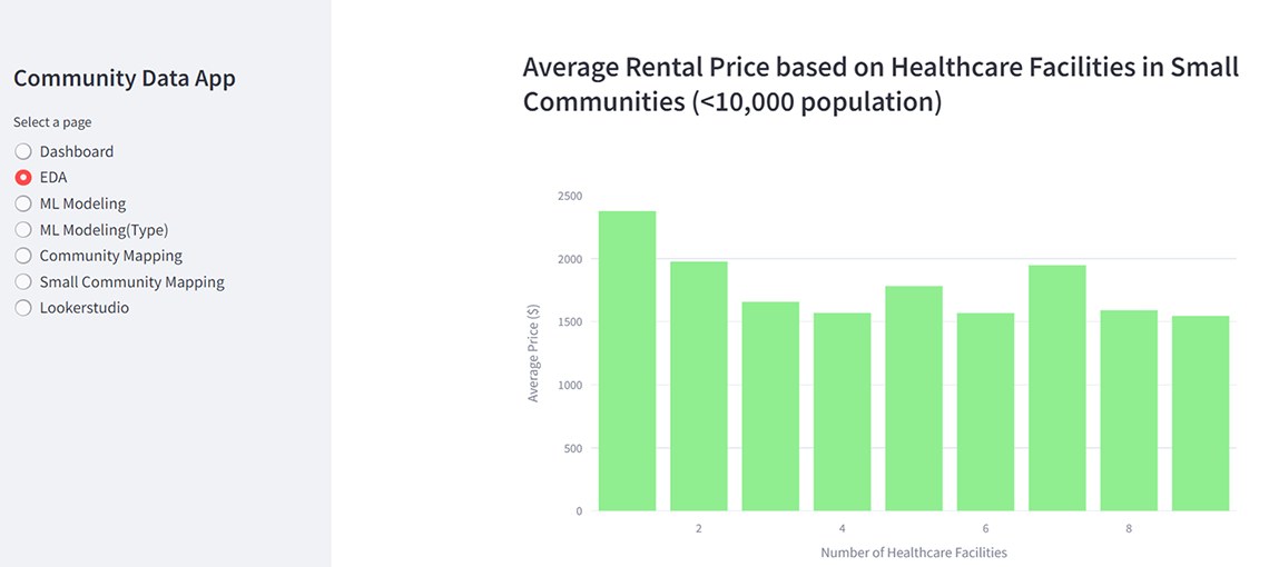
Description - Figure 9: Selection of EDA from app.
The image displays a bar graph titled "Average Rental Price based on Healthcare Facilities in Small Communities (<10,000 population)." The graph depicts average rental prices in various small communities, highlighting the impact of healthcare facilities on rental costs in these areas.
- ML modeling: Enables users to predict rental prices and property types based on input parameters.
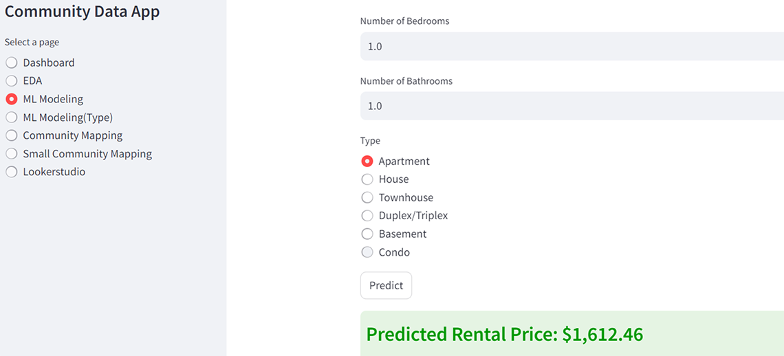
Description - Figure 10: Applying ML Model using the developed App.
The interface displays a rental price prediction module. Users can input attributes such as the number of bedrooms (set to 1.0), bathrooms (also 1.0), and select the type of property from options like Apartment, House, Townhouse, Duplex/Triplex, Basement, and Condo. After entering the details, the user can click the "Predict" button to generate a rental price estimate. The screenshot captures the result of this process, displaying a predicted rental price of $1,612.46.
- Community mapping: Displays rental housing listings on maps, providing spatial insights into market trends.
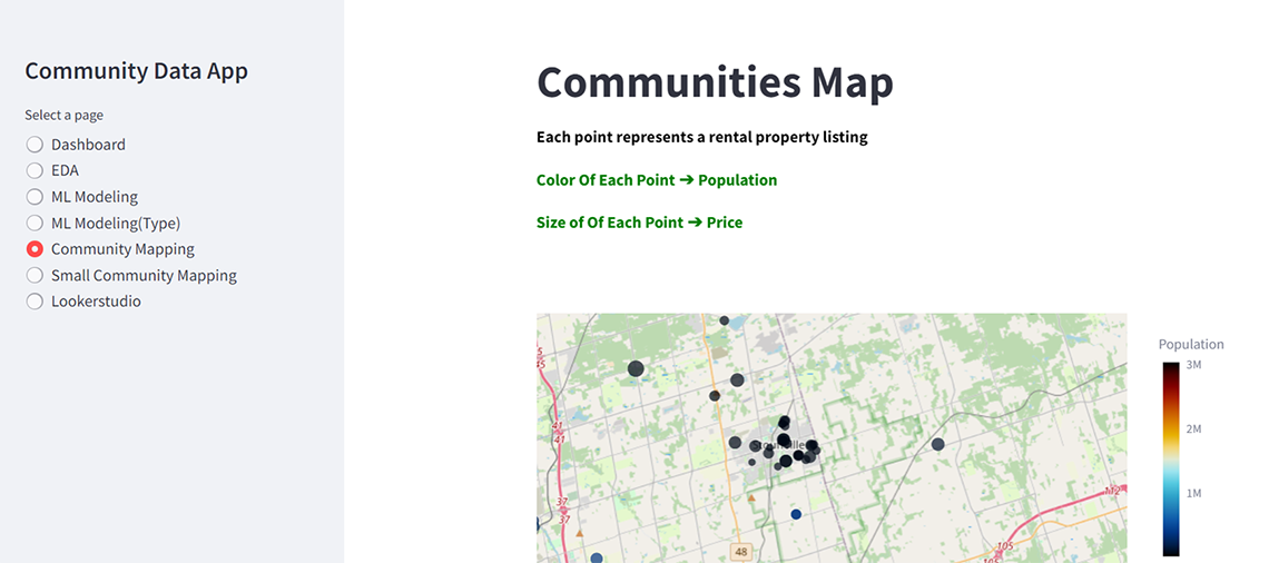
Description - Figure 11: Maps from the app.
This image displays the "Small Community Map: Population <10000" page. The geographic map visualization represents rental property listings with population less than 10000. Each point on the map corresponds to a property listing, with the colour indicating the population size and the point size reflecting the rental price.
- Google's Looker Studio Integration: Embeds additional insights and reports for enhanced analysis and visualization.
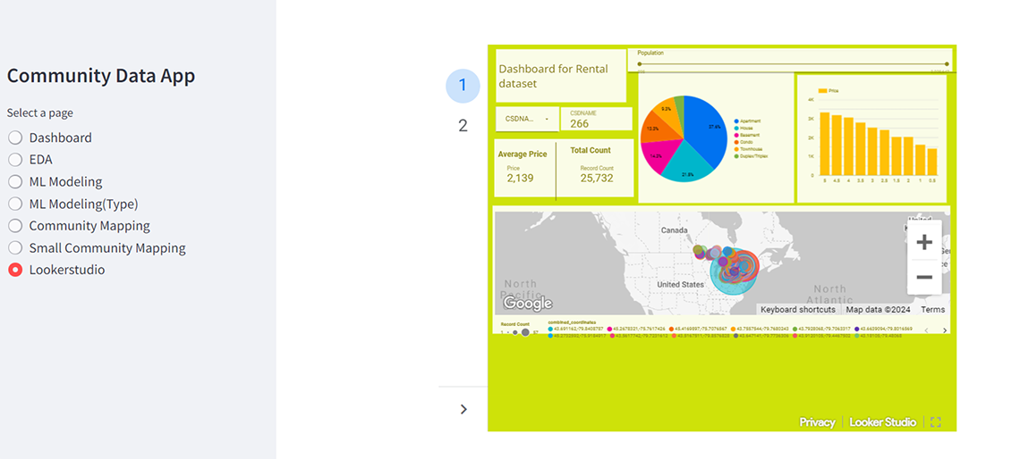
Description - Figure 12: Dashboard integration to the developed app.
This image shows the embedded visualization from Google Looker Studio. This enables users to dive deep into the data within the app.
User Experience
The application prioritizes user experience by offering an intuitive interface, interactive features, and real-time insights. Users can easily navigate between different sections, customize input parameters, and visualize results in a dynamic and engaging manner.
Impact and Benefits of the App
The Rental Housing Insights Application has the potential to make a significant impact on stakeholders and the community by:
- Providing valuable insights into rental housing trends and patterns.
- Supporting informed decision-making in real estate investments and property management.
- Empowering users with predictive analytics capabilities for strategic planning and resource allocation.
- Enhancing transparency and accessibility of rental housing data for policymakers, researchers, and community organizations.
Future work
The study offers a comprehensive exploration into the rental housing market in Ontario, Canada. By employing an EDA and ML techniques, the authors provide valuable insights into spatial trends, housing dynamics, and rental price forecasts, benefiting both metropolitan and small community markets.
Through meticulous data cleaning, feature engineering, and the application of various ML models, the study sheds light on crucial aspects such as price distributions, geographic influences, and the impact of housing attributes on rental prices. The development of an interactive Rental Housing Insights Application further enhances data exploration, predictive modeling, and spatial visualization, thereby empowering stakeholders with actionable insights and supporting informed decision-making in the rental housing market.
Overall, the study highlights the transformative potential of data-driven approaches in addressing complex societal challenges, such as affordable housing, and emphasizes the importance of collaboration between academia, industry, and government stakeholders to drive positive change in the rental housing landscape.
References
- Min, H., Wood, R., Seong-Jong, J. (2023). Machine Learning Methods and Predictive Modeling to Identify Failures in the Military Aircraft. International Journal of Industrial Engineering, 30(5), 1273-1283. 10.23055/ijietap.2023.30.5.8659
- Belcastro, L., Carbone, D., Cosentino, C., Marozzo, F., Trunfio, P. (2023). Enhancing Cryptocurrency Price Forecasting by Integrating Machine Learning with Social Media and Market Data. Algorithms 2023, 16, 542. 10.3390/a16120542
- Chaudhuri, T., Ghosh, I., Singh, P. (2017). Application of Machine Learning Tools in Predictive Modeling of Pairs Trade in Indian Stock Market. The IUP Journal of Applied Finance, Vol. 23, No. 1.
- Paul RK, Yeasin M., Kumar P, Kumar P, Balasubramanian M, Roy HS, et al. (2022). Machine learning techniques for forecasting agricultural prices: A case of brinjal in Odisha, India. PLoS ONE 17(7): e0270553.
- Pyo S, Lee J, Cha M, Jang H. (2017). Predictability of machine learning techniques to forecast the trends of market index prices: Hypothesis testing for the Korean stock markets. PLoS ONE 12(11): e0188107.
- Rowe, W. (n.d.). Mean Square Error & R2 Score Clearly Explained. BMC Blogs.
- R, V. (2018, September 11). Feature selection — Correlation and P-value. Machine Learning - The Science, The Engineering, and The Ops.
- sklearn.metrics.r2_score — scikit-learn 0.24.1 documentation. (n.d.). Scikit-Learn.org.
- panData. (2023, April 8). Exploratory Data Analysis (EDA): Techniques and Methods for Effective ML Models. Medium.
- Streamlit • The fastest way to build and share data apps. (n.d.). Streamlit.io.
- Looker business intelligence platform embedded analytics. (n.d.). Google Cloud.
- Ashraf, A. (2023, September 22). Correlation in machine learning — All you need to know. Medium.
- P-value in Machine Learning. (2020, July 9). GeeksforGeeks.
- Ray, S. (2019, March 7). 7 Types of Regression Techniques you should know. Analytics Vidhya.
- Brownlee, J. (2023, October 4). A Gentle Introduction to k-fold Cross-Validation. Machine Learning Mastery.